We’re back with more nDash product updates! Here’s a quick look at what’s new on the nDash platform:
Calendar Design Changes
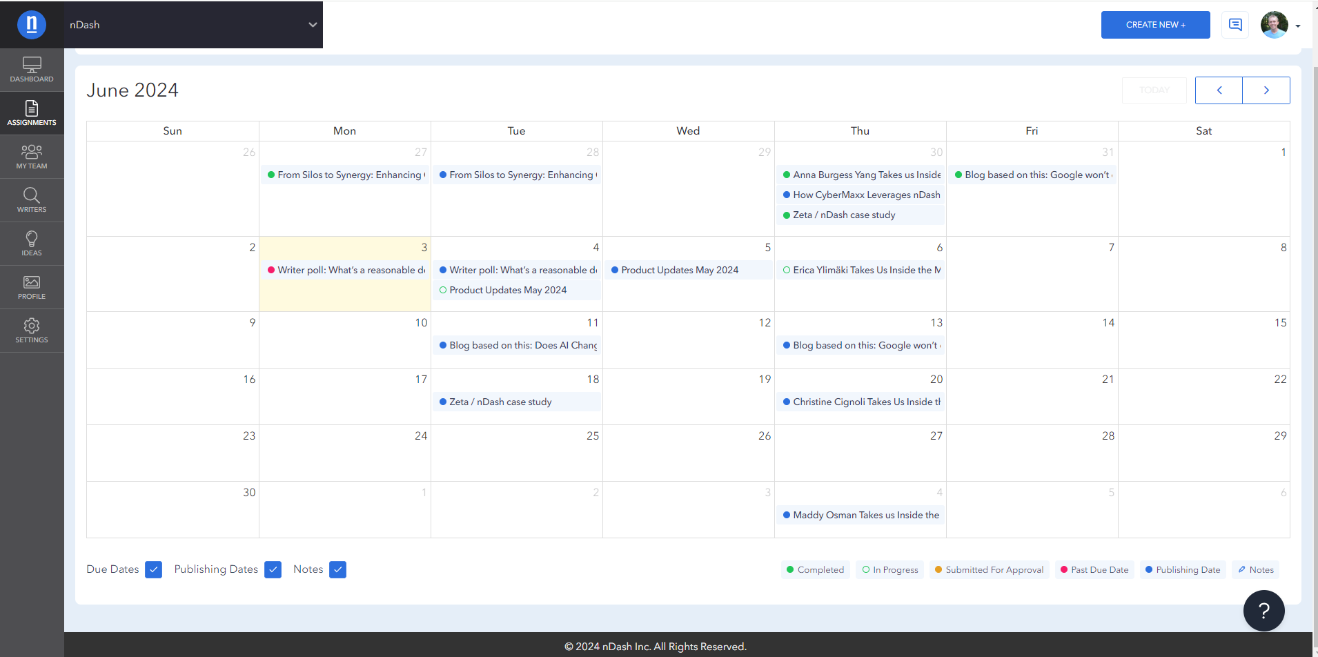
As part of the larger, ongoing redesign of the platform, we rolled out another visual improvement–with the nDash content calendar. The next time you log in, you’ll notice better contrast with the different assignment states and easier navigation to specific tasks.

We’ve discussed our content calendar in previous nDash product updates, but here’s a recap:
Streamline your content strategy with a centralized calendar that offers:
- Clear view: See all your upcoming content at a glance, making it easy to track campaigns and identify gaps in your schedule.
- Effortless scheduling: Drag and drop to adjust due dates and deadlines, keeping your internal and freelance teams on the same page.
- Stay organized: Differentiate between due dates for creation and publication to ensure timely content flow.
- Boost collaboration: Add notes and ideas directly to your calendar entries, fostering teamwork and brainstorming within your marketing team.
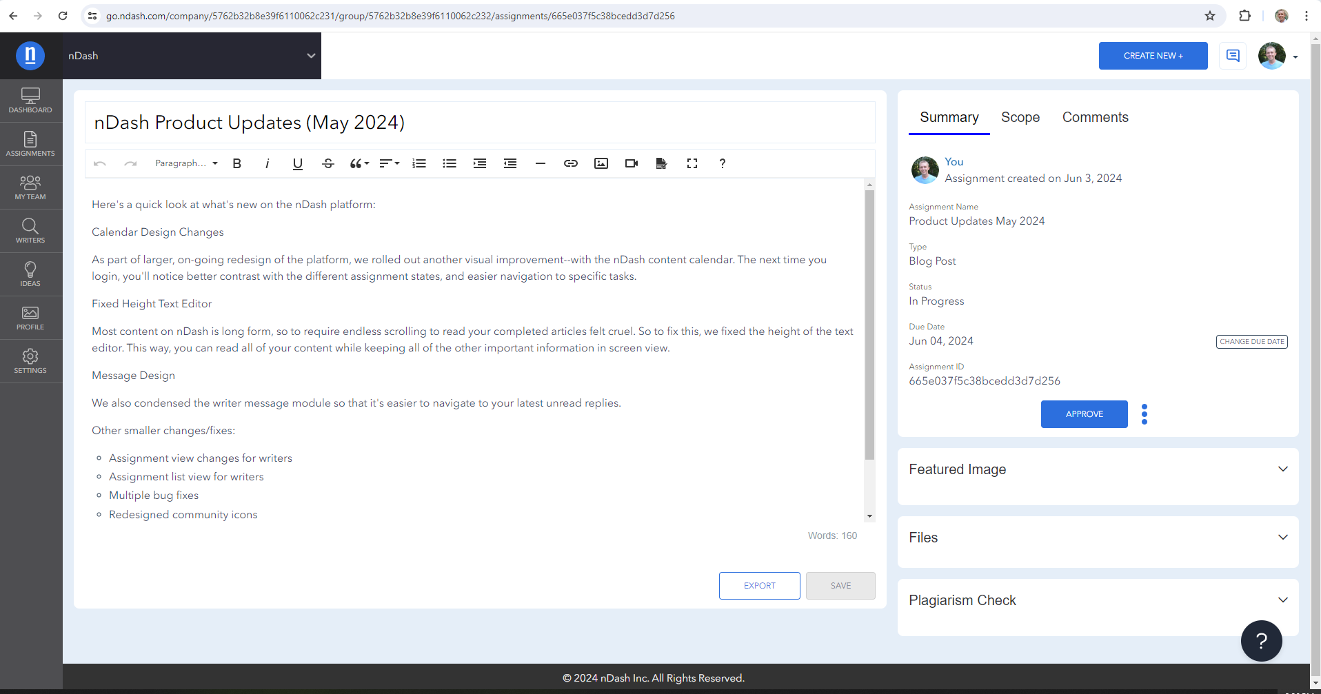
Fixed Height Text Editor
Most content on nDash is long form, so to require endless scrolling to read your completed articles felt cruel. So, to fix this, we fixed the height of the text editor. This way, you can read all of your content while keeping all of the other important information in the screen view.

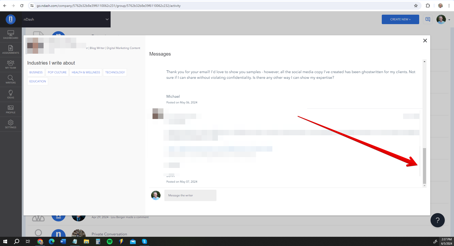
Message Design
We also condensed the writer message module so that it’s easier to navigate to your latest unread replies.

Other smaller nDash product updates: Changes and fixes
- Assignment view changes for writers
- Assignment list view for writers
- Multiple bug fixes
- Redesigned community icons
- Settings page redesign
Got a feature request for future nDash product updates? Let us know!
